
How to Add a Progress Bar in Shepherd
Shepherd.js is an easy to use interactive onboarding user guide that can help visitors throughout the content of the app. This is very useful if you want to show your users around, focus on your product’s strengths or just help the others find their way around your project more easily. Shepherd.js is an open source software that I highly recommend, because it is easy to use, has great documentation, friendly support team and most importantly - it can improve user experience and help your content convert more!
One of the things I found missing from the default options was a progress bar (progress indicatior) to show users where they are in their tour guide. In my opinion, a progress bar to indicate the progress of the intro tour is something that can increase overall user experience and is a must-have for your interactive guided tour. After some digging around, I figured out that this feature can be ironed out with just a few lines of js. In fact, there is already information about how to add a progress indicator in the official Shepperd documentation. Although it is a great starting point, it feels very basic and I was looking for something way more visual. I modified the progress tracker a bit to suit my needs and decided to share the end result with you in this blog post. In the end of this tutorial, you will be able to add a progress bar to your Shepherd tour that looks exaclty like this:
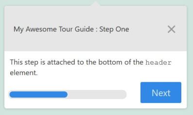
I hope that you will find this tutorial useful. If you wish, feel free to modify the progress bar even more and share the end result. Now, back to work!
Add a Basic Progress Bar to Shepherd
To add a progress bar, following Shepherd.js documentation, add the following js to the tour options:
    const tour = new Shepherd.Tour({
        defaultStepOptions: {
            classes: 'tour-guide',
            scrollTo: true,
            useModalOverlay: true,
            when: {
                show() {
                    const currentStepElement = shepherd.currentStep.el;
                    const header = currentStepElement.querySelector('.shepherd-header');
                    const progress = document.createElement('span');
                    progress.style['margin-right'] = '15px';
                    progress.innerText = `${shepherd.steps.indexOf(shepherd.currentStep) + 1}/${shepherd.steps.length}`;
                    header.insertBefore(progress, currentStepElement.querySelector('.shepherd-cancel-icon'));
                }
            }
        }
    });
If everything went well, here is how this should look on the site’s frontend:
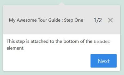
Great, we already got it to work. This “1⁄2” stats on the top right corner means that we are on the first step and there are two steps in total until the end of the tour. Cool, but how to turn this info into a beautiful progress bar? Keep reading to find out!
Customize the Progress bar
To be able to customize the progress bar, we will need to add some more html and add dynamically the progress width for each step. For example, if we have 2 steps in total (as in the above example), the width of the progress bar on the first step needs to be 50% and the width of the progress bar on the second step needs to be 100%. If we have more steps, the percentages will need to adjust accordingly. This may sound a bit overwhelming at the beginning, but it is not. All we need to do is to calculate the correct percentage with js and append a single line of css to include the width of the progress bar. Modify the show function to include the following:
show: function() {
    const currentStepElement = tour.currentStep.el;
    const header = currentStepElement.querySelector('.shepherd-footer');
    //create progress holder
    const progress = document.createElement('div');
    //create the progress bar
    const innerBar = document.createElement('span');
    //calculate the progress in percentages
    const progressPercentage = ((tour.steps.indexOf(tour.currentStep) + 1)/tour.steps.length)*100 + '%';

    //add class to the progress holder
    progress.className='shepherd-progress-bar';
    //add the width dynamically
    innerBar.style.width=progressPercentage;
    //if it is only one button, expand progress holder
    if (document.getElementsByClassName('shepherd-button').length==1) {
        progress.style.minWidth = '260px';
    }
    progress.appendChild(innerBar);
    header.insertBefore(progress, currentStepElement.querySelector('.shepherd-button'));
}
Here we are doing a couple of things. First, we create a progress wrapper, then a progress bar and add them to the DOM. We calculate the correct percentage for the current step and add it with the js .style method. Finally, let’s add some default css styles to make the progress look pretty. Add these in your css file:
.shepherd-progress-bar {
    position: absolute;
    left: 2%;
    bottom: 9%;
    font-size: 14px;
    border-radius: 9px;
    height: 20px;
    width: 100%;
    max-width: 180px;
    padding: 3px;
    background: #e6e6e6
}
.shepherd-progress-bar span {
    display: block;
    background: #3288e6;
    width: 50%;
    height: 100%;
    border-radius: 9px;
}
Now, when you visit the site again, you should see the progress bar. You might need to customize the above code to fit the requirements of your own project, but these are the general steps you need to follow. My whole code looks like this:
const tour = new Shepherd.Tour({
    defaultStepOptions: {
        classes: 'simple-tour-guide',
        scrollTo: true,
        cancelIcon: {
            enabled: true,
        },
        useModalOverlay: true,
        when: {
            show() {
                const currentStepElement = tour.currentStep.el;
                const header = currentStepElement.querySelector('.shepherd-footer');
                const progress = document.createElement('div');
                const innerBar = document.createElement('span');
                const progressPercentage = ((tour.steps.indexOf(tour.currentStep) + 1)/tour.steps.length)*100 + '%';

                progress.className='shepherd-progress-bar';
                innerBar.style.width=progressPercentage;
                // if only one button
                if (document.getElementsByClassName('shepherd-button').length==1) {
                    progress.style.minWidth = '260px';
                }
                progress.appendChild(innerBar);
                header.insertBefore(progress, currentStepElement.querySelector('.shepherd-button'));
            }
        },
    },
    confirmCancel: true,
});

//Construct the steps
const steps = [{
        title: 'My Awesome Tour Guide : Step One',
        text: 'This step is attached to the bottom of the <code>header</code> element.',
        attachTo: {
            element: 'header',
            on: 'bottom'
        },
        classes: 'my-awesome-additional-class',
        buttons: [{
            text: 'Next',
            action: tour.next
        }]
    },

    {
        title: 'My Awesome Tour Guide : Step Two',
        text: 'This step is attached to the bottom of the <code>.entry-content</code> element. If no such element is found, the step appears in the center of the screen.',
        attachTo: {
            element: '.entry-cotent',
            on: 'bottom'
        },
        classes: 'my-awesome-additional-class',
        buttons: [{
                text: 'Back',
                action: tour.back
            },
            {
                text: 'Finish',
                classes: 'shepherd-button-close',
                action: tour.hide
            }
        ]
    },

]

tour.addSteps(steps);

// Initiate the tour
tour.start();
Good luck and happy coding!
Read more: